So, you have an icon problem
Icons are prolific little gems. Everyone uses them, they get a little abused and misused. They are a stop gap for an easy out. Even more not everyone can agree on their definition and use.
So, you have an icon problem. So do I, what’s more the image above is a one of many. Living in the bowels of engineering in a large fortune 500 is fraught with perils as a designer. It gets compounded when dreaded “Acquisitions” happen.
What to do about it… here are some of the things we have done to ease some of the pain.
Technology
Hand waving evangelization
Timeline
Years
Role
Designer & Strategist
Date Completed
Ongoing
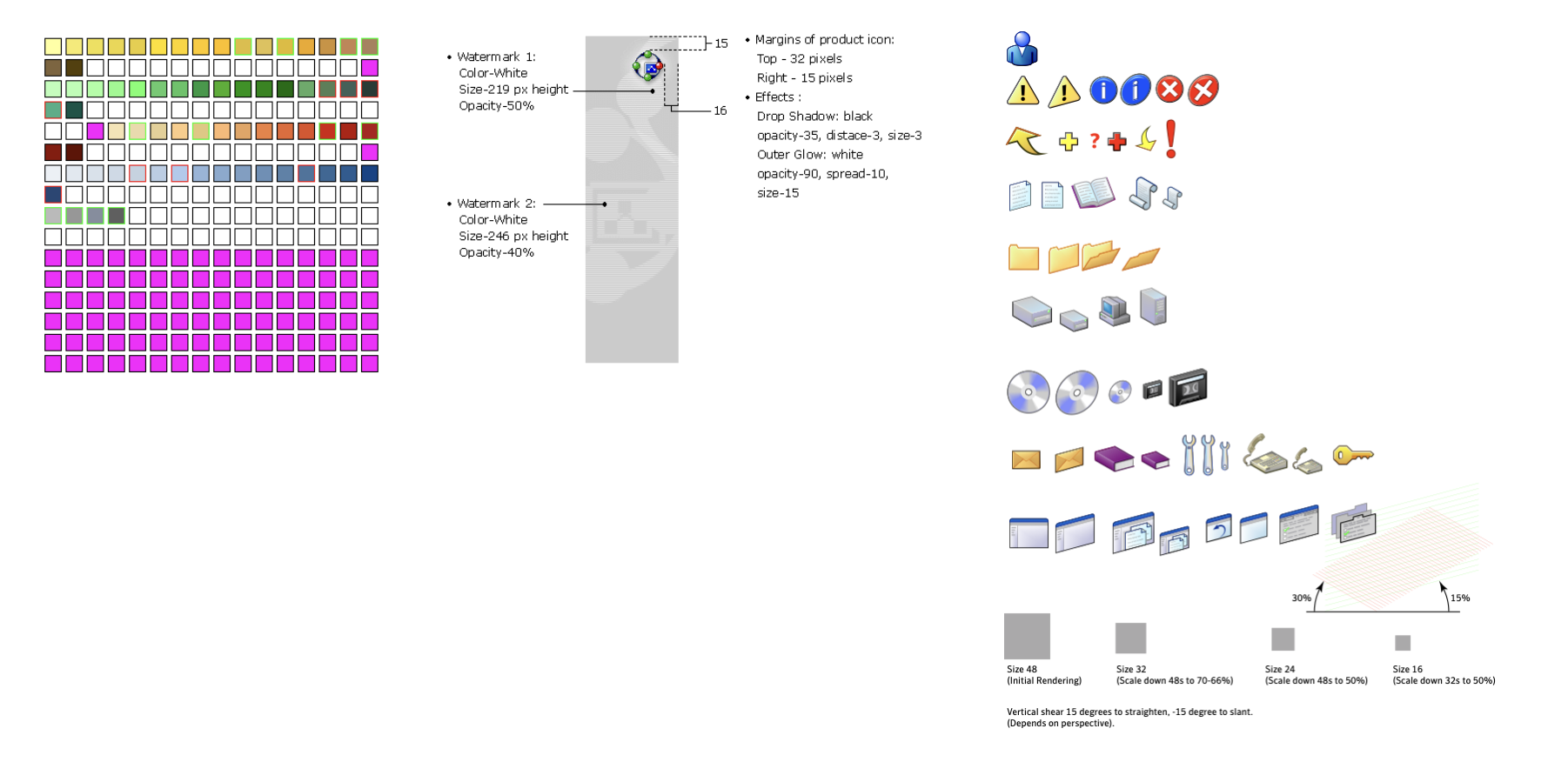
When I had started making icons they were 8 and 16bit icons, at the time Photoshop was the preferred tooling. To create a final icon color pallet had to be predefined and magenta was the knock out for transparency. Once this was done multiple sizes had to be produced for the various places the icons would live in the product.
Even still the problem that exists today was present back then. Too many icons, no common definition and the “Acquisitions”.
There were no libraries to buy, everything was done by hand and custom made. We did have to designate a person to be “Librarian”. Thanks Bob.
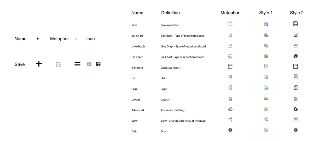
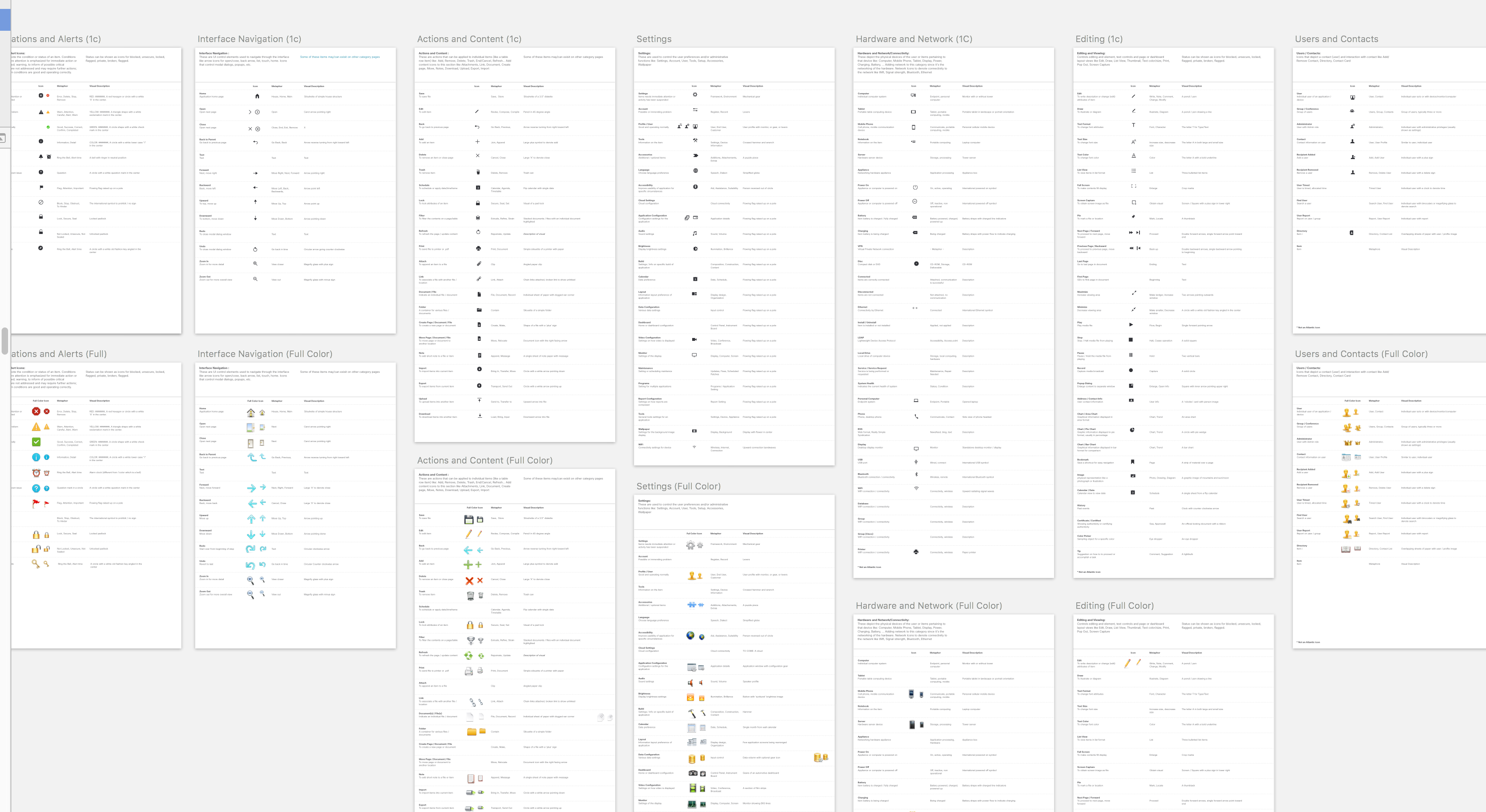
It is key to get this next bit correct. The equation above is what will make your icon system work. The “name” plus the “metaphor” makes the icon, mostly. This equation does have a few extra parts that mus be agreed upon. The “name” must have an agreed upon definition and “metaphor” as there can be multiples for each.
Once these two parts are sorted. Style becomes a hurdle across icon systems, including from within. Be clear and careful to get these agreed upon, reviewed and corrected if necessary.
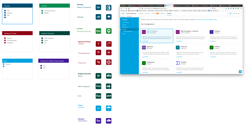
There are a couple more items to cover before I let you go. There are do’s and dont’s there are to most everything. This particular example covers several items. Including 508 compliance that we should all be quite aware of. As in the far left image. You may be able to categorize your products by color and group them with like offerings. Most organizations will not have this issue but in our case we are building for a large portfolio of over 25.
If you are able to get them categorize by color, 508 becomes and issue. In the middle image above, this can overcome by giving the image a secondary affordance of what that item is. This is all fine and dandy and can work as we see in the far right image.
One caution I give is that color can be a flash point. Not only will there be no good colors left, the particular hue may not be in favor, someone may not want to be Mr. Pink as they want to be Mr. Brown. 😉

Let’s bring it all together with the last few measures.
Write up a document that defines;
- When to use Icons
- When not to use Icons
- List out the alternatives to Icons
Put in place a mechanism for requesting icons. Set, delivery expectations as well as those of requestor. Be sure to speak with all your respective constituents so they have context and understand the reasoning behind “The Process”.
Put these items in places where your constituents reach your other Design System information and other requests. Such as your Design System site, ask Documentation or other groups to link to this information. If possible make sure common widely used icons are baked into the tooling of the Designer.
Industry Resources
Apple
https://developer.apple.com/library/mac/documentation/userexperience/conceptual/applehiguidelines/IconsImages/IconsImages.html
MicroSoft
http://msdn.microsoft.com/en-us/library/ms997538.aspx
Others
http://www.sitepoint.com/best-practices-for-icon-design
http://www.adobe.com/legal/permissions/icons-web-logos.html
http://design.tutsplus.com/articles/7-principles-of-effective-icon-design–psd-147
